I would have liked to have started from scratch and redesigned my site from the ground up, mulling over every pixel and color, and making it my own.
But that would have taken me months of hard work.
Instead, I redesigned my site in no time just by switching the theme.
My job was this :
get rid of the hamburger and the right-align buttons. Use words instead. Then blog about it.
What’s wrong with my site, June 2019
And my month was mostly occupied by this :

So I kept it simple by just choosing a new WordPress theme. And I’m quite happy with the result.
Before
For the first 3+ years of this blog, I used the theme Eighties, which looked something like this.

After
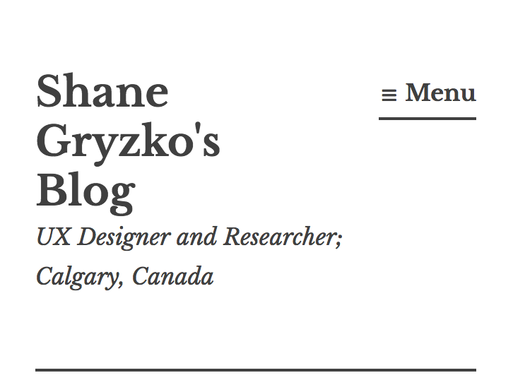
Now, I’m using the theme Libre 2, which looks like this. Note that my categories are slightly different from what I decided on last month.

How I chose it
WordPress allows you to filter by different features when searching for themes. What I wanted boiled down to ABC:
- Accessibility-ready (allows keyboard navigation, sufficient contrast, and more)
- Blog excerpts (when listing blog posts, it shows a snippet instead of showing the whole damn post)
- Classic navigation (no hamburger menu*)
Libre 2 not only met all of these needs, but it was also super clean and free. So I went with it.
*It does use a hamburger menu on small screens, but I’m okay with that, because it also has the word “Menu” next to the icon.

Next steps
I haven’t done much customization of the theme, but I’d like to look into adding a little splash of color, maybe actually using the logo I designed a couple years ago, and exploring different font choices.
But for now, I’m going to be happy that the hamburger and the stack of books are gone!
[…] Update: August Shane did his job too! See My lazy redesign. […]
LikeLike