I recently wrote about the book The Visual Display of Quantitative Information by Edward Tufte.
That book inspired me to explore ways of visualizing the vesting of savings and awards.
Background
Skip this section if you know equity!
Vesting
Vesting is when stock or cash becomes available. This allows companies to reward their employees for staying with them for a long time. Savings plan matching and stock options are two examples of
Savings plan matching
Savings plan matching encourages employees to save for their future. For every dollar an employee saves, the company will contribute a certain amount. This happens every paycheck. That company contribution is often subject to vesting. In other words:
Dear employee, you saved $1. Good job. You can have this quarter… but only if you are still working here one year from now.
Stock options
Stock options freeze the price of a certain number of shares for employees, who can then buy them a few years later. It’s like:
Dear employee, the stock price today is $30. If you’re still working for us in two years you can buy 200 shares for that price. In three years you can buy 100 more. And in four years 100 more!
Why?
This promise of future money is a win-win. It helps the employee because they get rewarded. It benefits the company because employees are owners too and are less likely to leave. Some people call it “the golden handcuffs”; I like to think of it as a carrot on a stick. There’s always some money just out of reach, which encourages employees to stay.

My process
Vesting and employee equity can be hard to explain but once you get it, you get it. I’ve spent a lot of time lately exploring ways of representing equity visually.
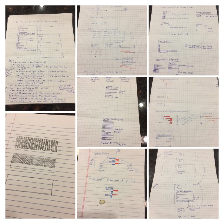
I have done a ton of sketching. And thinking. And sketching again. It’s funny how ideas in your head can seem perfect but their flaws are revealed when the pen hits paper.
Initially I explored the idea of plotting time vs quantity of upcoming vest events.
That didn’t always work because there are often large gaps between vest events. So I decided to order the vest events by date instead of scaling by date.
Here are some of my sketches.
I settled on a sparkline showing the quantity of vest, the award price, and the market price. What I like about this is that the area of each shape is proportional to its value. It explains complex concepts like stock options vs. RSUs at a glance.
I’ll illustrate this with an example. For a fictional employee with a few savings plan contributions and a recent stock option grant, the raw data might look something like this:
| Type | Vest Date | Quantity | Grant Price | Current Market Price | Estimated Value |
| Savings plan | 01-Aug-19 | 10 | $0 | $103.30 | $1,033.00 |
| Savings plan | 15-Aug-19 | 11 | $0 | $103.30 | $1,136.30 |
| Savings plan | 01-Sep-19 | 12 | $0 | $103.30 | $1,239.60 |
| Savings plan | 15-Sep-19 | 11 | $0 | $103.30 | $1,136.30 |
| Savings plan | 01-Oct-19 | 9 | $0 | $103.30 | $929.70 |
| Savings plan | 15-Oct-19 | 8 | $0 | $103.30 | $826.40 |
| Stock option | 28-Sep-20 | 50 | $114.23 | $103.30 | -$546.50 |
| Stock option | 28-Sep-21 | 25 | $114.23 | $103.30 | -$273.25 |
| Stock option | 28-Sep-22 | 25 | $114.23 | $103.30 | -$273.25 |
There’s a lot to digest here. And this is a simple example. For many employees, we have to limit the number of vests that we show because there are too many. But it becomes much more visual and compact if we represent it using what I like to call a vesting sparkline.
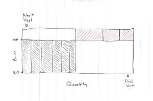
What I love about this is that it reduces all the complexity with grant prices and vesting timing into simple geometry!
The area of each box is proportional to its value. The savings plan vests are narrower because they’re smaller, but their $0 grant price makes them quite valuable. The option vests are currently underwater, meaning their grant price is higher than the market price. But if the price jumps, they’ll be much more valuable than the savings plan vests.
I think this idea has potential.
Or am I crazy?
I’ve obsessed over these sparklines on and off for a month. I’m way too close to them to be objective. So, readers, please let me know if this idea sucks!
And more importantly, I need to try these charts out with real data. What will it look like for typical Australian employees? What about German executives?
If I’m satisfied that I can cover all cases with the design, I’ll then test prototypes with coworkers and real customers. Do they understand what they’re looking at? How can I tweak the design to help?
I’m hoping that this will make it into production but even if it doesn’t at least I had fun doing it!

[…] For details on these charts, see Visualizing vesting schedules. […]
LikeLike
[…] month I wrote about my process of designing what I called vesting sparklines. I was super excited about them because they packed so much information into a small area and […]
LikeLike